Yo, what’s up, my peeps? Today, we’re gonna talk about CSS preprocessors , transitions and animations. CSS preprocessors are like seasoning for your CSS.
They make it more flavorful and easy to work with. And transitions and animations are like the special effects of your web page. They make it pop and stand out from the crowd.
CSS preprocessors
Let’s start with CSS preprocessors. CSS preprocessors are like translators. They take your fancy code and turn it into regular CSS that browsers can understand. The two most popular CSS preprocessors are Sass and Less.
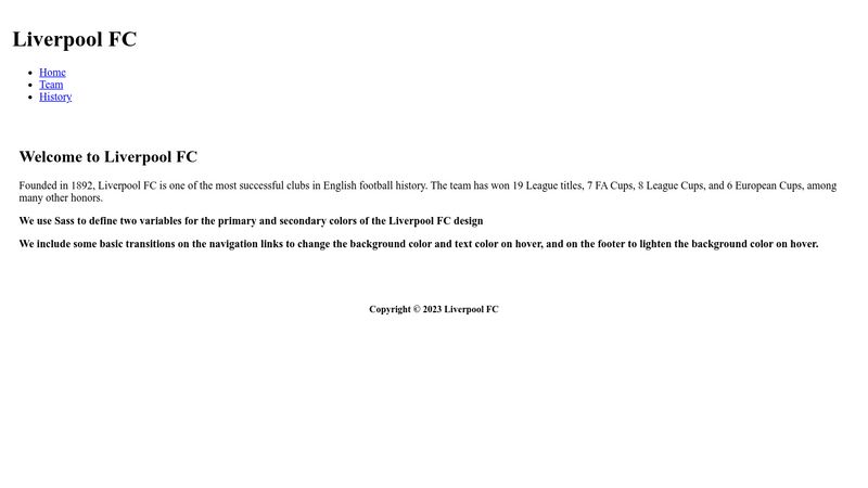
Sass stands for Syntactically Awesome Style Sheets, and it’s like the spice rack of your CSS. It adds features like variables, nesting, and mixins to regular CSS.
For example, with Sass, you can create a variable for your primary color like this:
$primary-color: #ff0000;
And then use it throughout your CSS like this:
button {
  background-color: $primary-color;
}
This will set the background color of all the buttons on your page to the primary color variable
Less, on the other hand, is like the sous chef of your CSS. It’s similar to Sass but with a slightly different syntax.
Now let’s move on to transitions and animations. Transitions and animations are like the dance moves of your web page. They add some rhythm and flow to your design.
CSS Transitions
Transitions are like smooth moves.
They’re like the glue between two states of an element. For example, if you wanna animate the background color of a button when you hover over it, you can do it like this:
button {
  background-color: blue;
  transition: background-color 0.5s ease;
}

button:hover {
  background-color: red;
}
This will smoothly transition the background color of the button from blue to red when you hover over it.
CSS Animations
Animations, on the other hand, are like dance routines.
They’re more complex and can involve multiple elements and states. For example, if you wanna create a spinning animation for a div, you can do it like this:
@keyframes spin {
  from {
    transform: rotate(0deg);
  }
  to {
    transform: rotate(360deg);
  }
}

div {
  animation: spin 2s infinite linear;
}
This will create a spinning animation for the div that lasts for 2 seconds and repeats infinitely.
Conclusion
And that’s the basics of CSS preprocessors and transitions and animations, fam!
With these tools, you can create some dope designs and make your web page stand out from the crowd.
So, get out there and experiment with Sass, Less, transitions, and animations to create something truly unique.
Peace out!


Webentwickler sind die Drahtzieher hinter reibungslosen Online-Erlebnissen.