Hey, what’s up my homies? Today, we’re talking about CSS Flexbox and CSS Grid.
These are two layout tools that can help you create some tight designs and make your web page look fly.
CSS Flexbox
First up is CSS Flexbox. Flexbox is like a squad of dancers. It allows you to arrange elements in a row or column and control how they move and flow.
To use Flexbox, you gotta set the display property to “flex”. For example:
.container {
  display: flex;
}
This will turn the container into a Flexbox container.
With Flexbox, you can control the order of elements, align them vertically and horizontally, and create responsive designs. For example:
.container {
  display: flex;
  flex-direction: column;
  justify-content: center;
  align-items: center;
}

.box {
  order: 2;
}
This will create a Flexbox container with elements centered vertically and horizontally.
The “box” element will be moved to the second position.
CSS Grid
CSS Grid is like a chessboard. It allows you to create a two-dimensional grid of columns and rows and place elements within it.
To use Grid, you gotta set the display property to “grid”. For example:
.container {
  display: grid;
  grid-template-columns: repeat(3, 1fr);
  grid-template-rows: repeat(3, 1fr);
}
This will turn the container into a Grid container with 3 columns and 3 rows
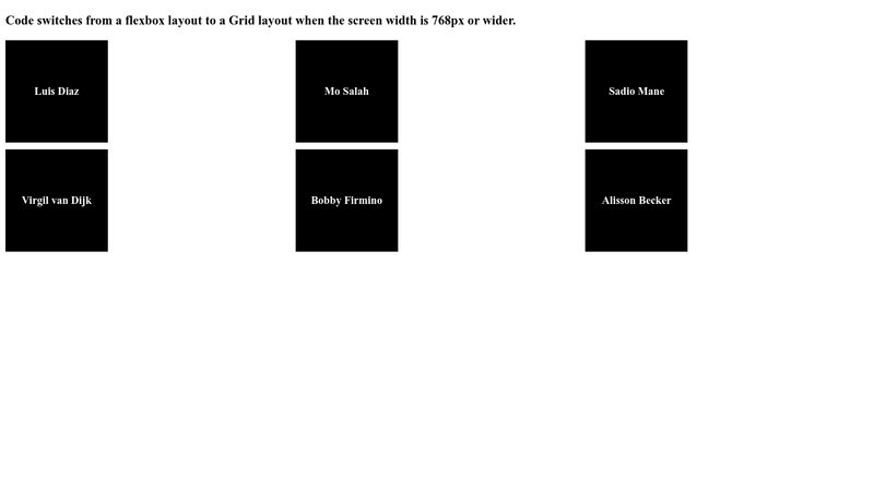
Now let’s talk about how you can use these layout tools to create dope designs
Conclusion
And that’s the basics of CSS Flexbox and CSS Grid, my peeps!
With these tools, you can create some dope designs and make your web page stand out from the crowd.
So, get out there and experiment with Flexbox and Grid to create something truly unique.
Peace out!